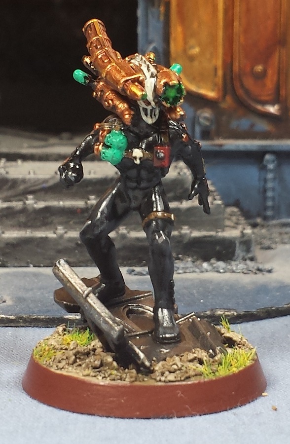
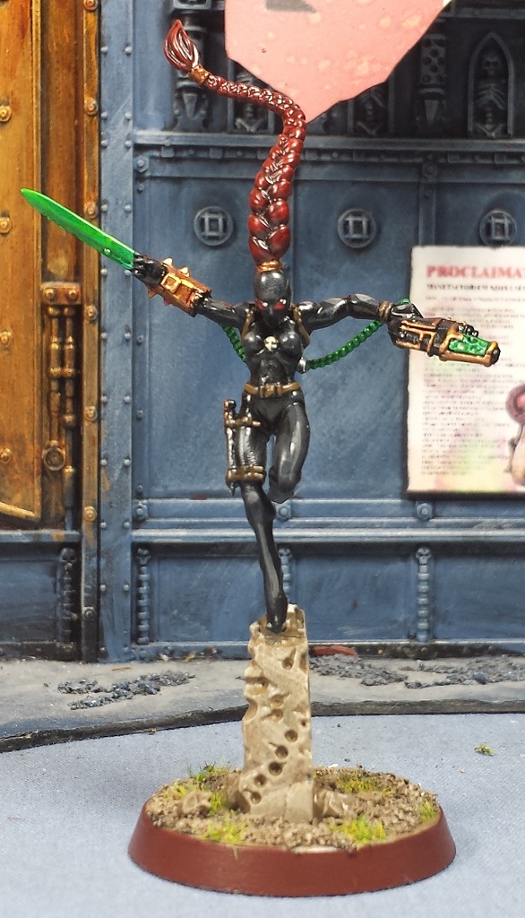
Fairly busy weekend, but I did get some build time in where I took a crack at the new Magos Dominus model. Two of them, to be accurate!
I figured I'd do a Magos and an Archmagos, utilizing the various options in the kit - one built bog standard, and the other with the alternate head and weapon options. I also swapped out the servo-skull with the slightly more ornate one from the Scions kit. I experimented with the arms a bit, but the design is such that it would require some serious cutting and greenstuff to change the posing.
I'm thinking I'll do the basic Magos with red robes and white detailing, and the Archmagos with the reversed color scheme to help differentiate them a bit further. Quite looking forward to getting stuck in, this sculpt is absolutely fantastic!
Sunday, May 31, 2015
Thursday, May 28, 2015
40k Adeptus Mechanicus - Army underway!
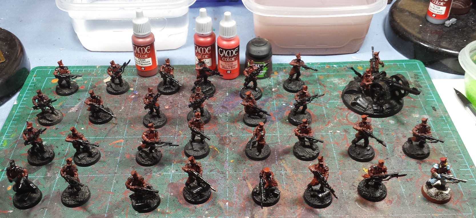
Sadly my main cogitator has been handed over to some specialist magos for rehabilitation, as my dabbling in tech-heresy (thou shalt not attempt to improve upon the workings of the machine) has once again proven near-fatal to the device. So, one-picture posts it is for a little while longer! I'd decided to take a little break from the tidal wave of yellow and settled in for a nice protracted ad-mech build session, where I knocked together a pair of dragoons, a unit of ruststalkers and a box of the kastellan robots.
...Then jumped right in to getting paint on 'em! Without my main distraction machine around, I've been getting in a good amount of brush time, and have essentially been batch painting the lot! Still a ways to go yet, but they're coming along nicely so far. Really been digging the look of the new GW sculpts overall, and for the first time in years I'm finding that in many cases I actually prefer the GW aesthetic to FW's take on the Mechanicum - the Robots being the main exception, the FW versions have been phenomenal while the GW ones leave me a little cold. They're not bad by any means (and I feel they're much better in person than they seem in photographs), but the Castellax and Vorax are just light-years better sculpts. The Skitarii as basic troops are far nicer models than the tech thralls (granted, the thralls should be less menacing being armed rabble), and the upcoming magos model in the GW line I find far cooler than the slug magos on the FW side. It's cool and creepy, but just doesn't grab me. When all is said and done, I think there's room for both - they're intended to be radically different things and as a long time servant of the Machine God I'm ecstatic that for the first time in 30 years not only are there official models now, but there's two danged armies worth of 'em! Hah!
More to come soon!
Monday, May 25, 2015
Heresy Era Imperial Fists - Time for a family photo!
Dealing with some recalcitrant machine spirits in my primary cogitator again (Omnissiah, why hast thou forsaken me?), so I'm forced to post from my phone. That makes getting all the numerous pics uploaded for the next post in the hobby series a little challenging, so here's a quick filler post for the holiday weekend - a whole mess of Imperial Fists!
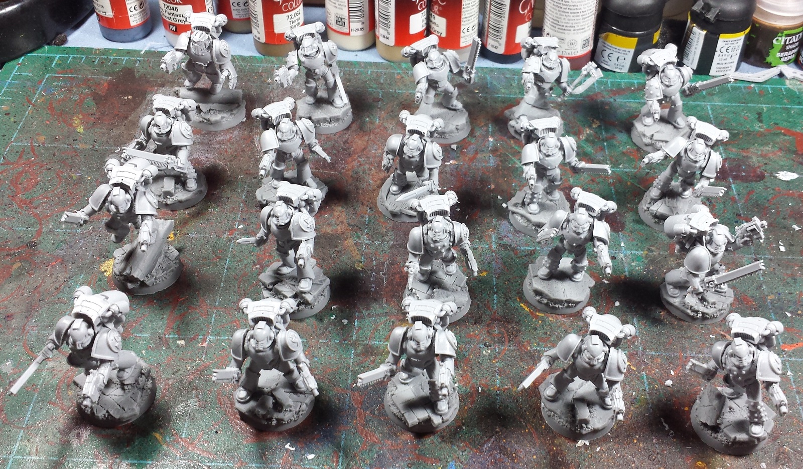
As usual as I paint the units they go into the battlefoam trays and into the Closet of Doom, so it is always a pleasant surprise to pull 'em back out and see what the progress really looks like! At this point it's a valid army, but there's still a few more things to add before it's a viable army. Two Sicaran Venators and a pair of Proteus Land Raiders should add a bit of zest to the force.
That said, I gotta say I'm pretty burned out painting yellow after finally getting the 20 tac marines done (more pics of those to follow), so I'm thinking for my own sanity it's time to change gears and crack open a few boxes of the new GW Adeptus Mechanicus miniatures I've been squirreling away over the last few months - should be fun!
Thursday, May 21, 2015
Mordian7th's Tips and Tricks, Part III - Application
Real Life(tm) reared its ugly head over the past week, delaying this series somewhat - Back in the saddle and time to press onwards however! Now that we've got an idea of what colors we want for the minis, it's time to think about how to get those ideas onto the models. Buckle up, this is gonna be a long one!
Primer Colors - As I'd stated before 99% of the time I start off with a black primer, as I tend to paint 'dark to light'. This means that generally the models will be of a darker hue overall, and it's worth noting that certain colors don't work well when painted directly onto a black undercoat (more on that below). A white primer allows for a much more brilliant and vivid end result, but much more care must be taken to ensure that all of the underlying white areas are properly covered. The effort involved for that outweighs the end result in my opinion.
I have dabbled in alternate primer colors as well, using a brown primer to undercoat the WW2-themed Orks from a while back, and have tried a metallic silver on an abortive Necron force that never really got off the ground.
Base/Shade/Highlight - "Three color minimum" is a phrase often used in events requiring painted models. While surely just slapping on three colors chosen from the Triad or Split Complimentary would meet the bare requirements, without some shading and highlighting of those colors the models will tend to look flat and lifeless. So I like to think of any color being applied as having its own three color minimum - What this means is any color that I apply will have a darker tint in shaded/recessed areas, a mid-tone (or two) and finally a highlight on the areas most exposed to light. As mentioned in an earlier post, I tend to paint dark-to-light so rather than starting with a mid tone and shading down and highlighting up, I'll start by blocking in the areas in the shade color first, then build up in brightness from there. For example, the green on the Rogue Trader's pants consist of Jade Green (shade), Foul Green (mid-tone) and Livery Green (highlight). Any other colors will also consist of at least three tones, so even a model painted to a "three color minimum" would in fact include at least 9 distinct paint colors if not more!
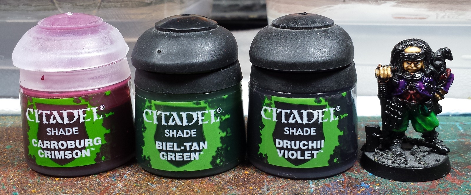
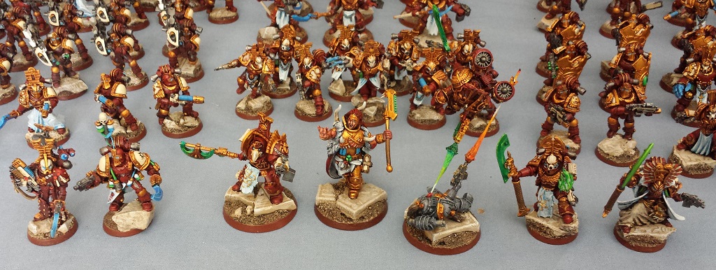
For example, when painting the red on the Thousand Sons/Spireguard, I started off with a dark reddish brown Dark Flesh (shade color), then applied a heavy Gory Red drybrush (mid tone) followed by a light Blood Red drybrush (highlight). A Carroburg Crimson wash is then applied, which helps to blend the reds together, and darken the whole trio down somewhat.
Color blocking - It's worth considering what areas will be getting what colors in what order, and I utilize the "Inside Out" method, which means that in general I'll start with things like skin or underclothes, then work my way outwards through the layers of clothing and armor, and ending with any pouches/bags/equipment that may be attached on the outermost layers. This allows me to be pretty sloppy with my application early on, as subsequent layers will clover up any overspill. For example, when painting the Ork's skin in the picture above, I'm not too worried if the color slops up over onto the armor, as those areas will be painted over and cleaned up in a subsequent stage.
Application methods - Coupled with the multiple color tints, the various steps are generally done using two main styles of painting, what I consider basecoating and drybrushing.
Basecoating - When I'm applying the first dark shade of a color, I'll use the brush to fully block in the entire area leaving none (or verrrry little) of the black primer color showing. It is important to avoid obscuring detail with thick application of the basecoat, the use of the wet palette will help, but Ill generally ensure that the brush has a little water in it when picking up the paint from the palette as well. I don't go down to the full 'milky consistency and 5-6 applications' level, for my purposes the basecoat will usually go on in 1-3 coats depending on the opacity of the paint in question.
Darker colored/more opaque basecoats such as the Jade Green used on the Rogue Trader's pants will usually cover in a single pass, while lighter/more translucent colors such as oranges and reds may take a few layers to get rid of any streaky appearance of the underlying black primer (more discussion below on opacity).
Drybrushing - In opposition to the 'thin your paints' advice above, when it comes to drybrushing you want very little to no water involved. This is my primary means of painting, and is where cheap/old brushes shine. Load up your brush with the color, then use a paper towel or piece of paper/cardboard to wipe off most of it. You can see my 'dry palette' above, where I scrub off the majority of the paint on the brush. Once a swipe is only leaving a little bit of paint behind it's time to apply it to the miniature - unlike the basecoating step above where we try to ensure everything is colored in, just draw the brush lightly over the surface of the model, and the little bit of paint let on the brush will adhere to any upraised surfaces, leaving the recesses untouched.
The more pressure applied, the more paint will be left on the model/deeper into the recesses. I took advantage of this with a heavy drybrush pass in the mid-tone Foul Green color, leaving just a little of the Jade Green base coat in the recesses...
...and then a lighter drybrush pass with the highlight Livery Green color, leaving some of the mid-tone color showing, as well as the shade color. While natural light on a miniature will provide actual shadows, the various green shades force the perspective thereby making the textures of the pants much more obvious from a distance thereby giving the miniature a sense of scale.
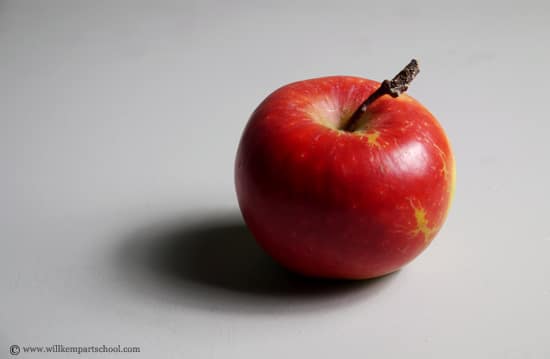
One other thing to bear in mind when drybrushing/highlighting in order to help the textures really stand out is where the light is hitting the model. While it's certainly feasible to just brybrush all over the model thereby picking out all the raised areas with the highlight colors, it's slightly more realistic to concentrate the drybrushing primarily on areas that would be hit by the light source. I generally assume the light is coming from overhead, so I'll concentrate on the uppermost surfaces of the models, leaving the shade colors more pronounced on the undersides. The picture of the apple above is a decent example - Technically in reality the whole apple is roughly the same color of red, but the upper surfaces reflect more light and as such look brighter than the underside that sits in shadow. It is by exaggerating these color variations that a miniature can appear to be lifelike in a tiny scale, as opposed to just a small sculpture.
Washes -Washes provide a fantastically easy way to provide shading and subtle color gradients to a miniature. The nature of the medium is such that it will tint the base color as well as flow into any recesses providing a deeper shade in those areas - essentially the opposite of drybrushing's effect. I'll almost always include a wash stage in every color. For example the reds, greens and purples all got matching washes. The washes help soften any graininess that a drybrushing step might cause, and help to blend the color gradients together.
While it's simple enough to just wash a color with its matching shade, some interesting effects can be achieved by washing colors with complementary shades as well. For example the Alpha Legion scouts above started off with a green undercoat, and then multiple successive passes of blue wash were applied. Similarly the yellow of the recent Imperial Fists includes a Sepia wash, and my go-to gold recipe utilizes a fleshtone wash. Definitely worth experimenting with the possible color combinations!
A wash means it's break time! Usually using a wash signifies the final step in a given painting session for me. Unlike acrylics which will dry in moments, a wash really needs a good long time to dry. If you end up getting any fresh paint onto an area where a wash is still wet, it will have a tendency to wick the paint or alter the color. Definitely let a washed model sit for a good half hour or more!
Painting in Black and White - Unlike the colors we've been discussing above, black and white have some interesting properties to bear in mind when working with them. With colors, there's the idea of a shade/midtone/highlight, but black and white each sit on an end of the spectrum - You can't paint something darker than black (barring crazy science), and you can't highlight something that's white. In the case of black, I'll generally really push the edge highlights, or add a fair bit of weathering to contrast against it. It's a color that I struggle with the most, personally! On the other side of the coin, one of the best pieces of advice I ever received was 'never paint with pure white'. What this means is against other colors, even a light grey will end up looking white. I'll generally start with a light blue or shadow grey basecoat, followed by a stonewall or cold grey midtone, and highlight with ghost grey. A pure skull white color may be used as a verrry thin extreme edge highlight if desired, but that's about the extent of its use (other than as a tinting agent when mixing ones own colors).
Opacity considerations, or why certain colors are 'harder' to paint than others - Certain paint colors by different manufacturers tend to be more opaque than others, generally the ones toward the green to blue end of the spectrum are more opaque, while the ones toward the orange and yellow end tend to be more translucent. This means that the undercoat colors matter far more when using them - a translucent yellow painted over a black basecoat will tend to look splotchy and lifeless, but will be very bright and shiny over a white basecoat. As I almost always start with a black primer, this means that part of the process for painting translucent colors is to start off with a basecoat shade that has enough opacity to cover the black, and provides a complimentary color for the final color - for example my red recipe always starts with a Dark Flesh basecoat, as the reddish-brown tone covers the black well, but also provides a warmer color for subsequent reds to build on. A bit of this can be seen on the bases of the Thousand Sons above - The black of the base shows through the red, making it look dull, while the red of the armor (with the dark flesh undercoat) is much warmer in tone.
Batch Painting - As many of you are aware, I'm a big proponent of the batch painting idea whereby I'll work on 20+ models at a time. What this means is I'll get a whole mess of models that all get the same paint job, and just work through each color assembly-line style - every one gets the basecoat color, then each one will get the mid-tone, then the highlight, and so on through the scheme until at the end all of them are complete. This helps keep consistency between models, and it's a nice feeling to suddenly have a huge pile of completed models. I'll generally set a goal of getting one to three colors done in a given session, then take a break and come back later on/the next day for another one to three colors and so on. After four or five sessions suddenly everything's done all at once! This sort of thing can be a little on the tedious side, so I'll generally have some form of entertainment going such as some music, a movie on in the background or far more common, an audiobook. I've been cranking through the Horus Heresy novels while painting all the Heresy miniatures, it's a great source of inspiration, and helps keep my mind off the whole "18 more to go... 17 more to go... 16 more to go..." issue. Hah!
Next up will be some discussion of painting fine details such as faces and decorations, as well as putting the finishing touches on the models!
Primer Colors - As I'd stated before 99% of the time I start off with a black primer, as I tend to paint 'dark to light'. This means that generally the models will be of a darker hue overall, and it's worth noting that certain colors don't work well when painted directly onto a black undercoat (more on that below). A white primer allows for a much more brilliant and vivid end result, but much more care must be taken to ensure that all of the underlying white areas are properly covered. The effort involved for that outweighs the end result in my opinion.
I have dabbled in alternate primer colors as well, using a brown primer to undercoat the WW2-themed Orks from a while back, and have tried a metallic silver on an abortive Necron force that never really got off the ground.
Base/Shade/Highlight - "Three color minimum" is a phrase often used in events requiring painted models. While surely just slapping on three colors chosen from the Triad or Split Complimentary would meet the bare requirements, without some shading and highlighting of those colors the models will tend to look flat and lifeless. So I like to think of any color being applied as having its own three color minimum - What this means is any color that I apply will have a darker tint in shaded/recessed areas, a mid-tone (or two) and finally a highlight on the areas most exposed to light. As mentioned in an earlier post, I tend to paint dark-to-light so rather than starting with a mid tone and shading down and highlighting up, I'll start by blocking in the areas in the shade color first, then build up in brightness from there. For example, the green on the Rogue Trader's pants consist of Jade Green (shade), Foul Green (mid-tone) and Livery Green (highlight). Any other colors will also consist of at least three tones, so even a model painted to a "three color minimum" would in fact include at least 9 distinct paint colors if not more!
Color blocking - It's worth considering what areas will be getting what colors in what order, and I utilize the "Inside Out" method, which means that in general I'll start with things like skin or underclothes, then work my way outwards through the layers of clothing and armor, and ending with any pouches/bags/equipment that may be attached on the outermost layers. This allows me to be pretty sloppy with my application early on, as subsequent layers will clover up any overspill. For example, when painting the Ork's skin in the picture above, I'm not too worried if the color slops up over onto the armor, as those areas will be painted over and cleaned up in a subsequent stage.
Application methods - Coupled with the multiple color tints, the various steps are generally done using two main styles of painting, what I consider basecoating and drybrushing.
Basecoating - When I'm applying the first dark shade of a color, I'll use the brush to fully block in the entire area leaving none (or verrrry little) of the black primer color showing. It is important to avoid obscuring detail with thick application of the basecoat, the use of the wet palette will help, but Ill generally ensure that the brush has a little water in it when picking up the paint from the palette as well. I don't go down to the full 'milky consistency and 5-6 applications' level, for my purposes the basecoat will usually go on in 1-3 coats depending on the opacity of the paint in question.
Darker colored/more opaque basecoats such as the Jade Green used on the Rogue Trader's pants will usually cover in a single pass, while lighter/more translucent colors such as oranges and reds may take a few layers to get rid of any streaky appearance of the underlying black primer (more discussion below on opacity).
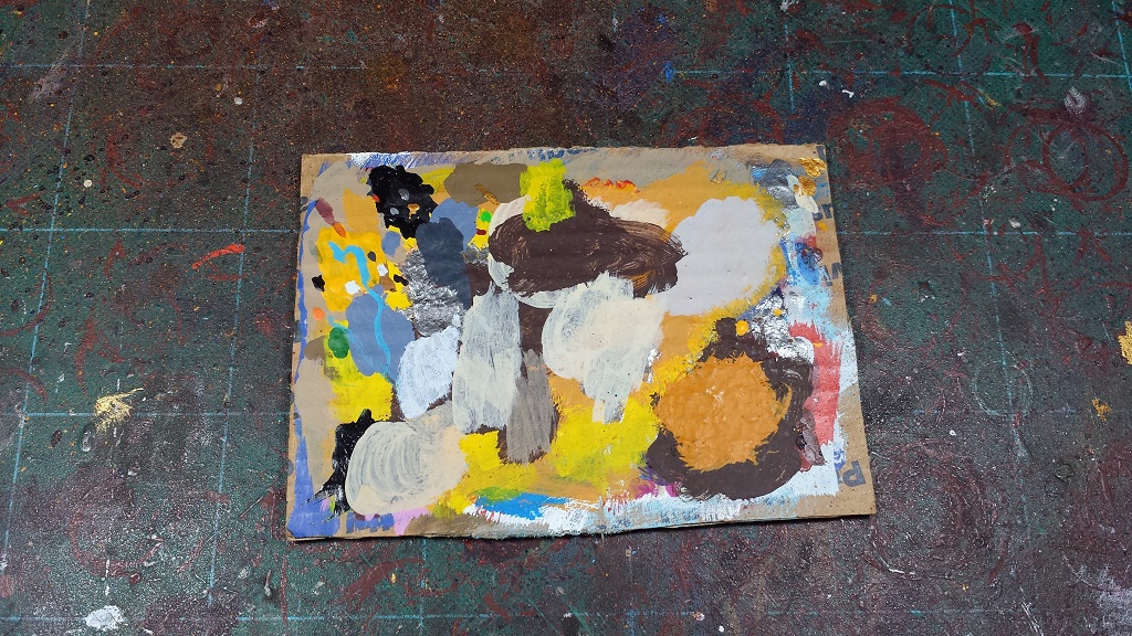
Drybrushing - In opposition to the 'thin your paints' advice above, when it comes to drybrushing you want very little to no water involved. This is my primary means of painting, and is where cheap/old brushes shine. Load up your brush with the color, then use a paper towel or piece of paper/cardboard to wipe off most of it. You can see my 'dry palette' above, where I scrub off the majority of the paint on the brush. Once a swipe is only leaving a little bit of paint behind it's time to apply it to the miniature - unlike the basecoating step above where we try to ensure everything is colored in, just draw the brush lightly over the surface of the model, and the little bit of paint let on the brush will adhere to any upraised surfaces, leaving the recesses untouched.
The more pressure applied, the more paint will be left on the model/deeper into the recesses. I took advantage of this with a heavy drybrush pass in the mid-tone Foul Green color, leaving just a little of the Jade Green base coat in the recesses...
...and then a lighter drybrush pass with the highlight Livery Green color, leaving some of the mid-tone color showing, as well as the shade color. While natural light on a miniature will provide actual shadows, the various green shades force the perspective thereby making the textures of the pants much more obvious from a distance thereby giving the miniature a sense of scale.
One other thing to bear in mind when drybrushing/highlighting in order to help the textures really stand out is where the light is hitting the model. While it's certainly feasible to just brybrush all over the model thereby picking out all the raised areas with the highlight colors, it's slightly more realistic to concentrate the drybrushing primarily on areas that would be hit by the light source. I generally assume the light is coming from overhead, so I'll concentrate on the uppermost surfaces of the models, leaving the shade colors more pronounced on the undersides. The picture of the apple above is a decent example - Technically in reality the whole apple is roughly the same color of red, but the upper surfaces reflect more light and as such look brighter than the underside that sits in shadow. It is by exaggerating these color variations that a miniature can appear to be lifelike in a tiny scale, as opposed to just a small sculpture.
Washes -Washes provide a fantastically easy way to provide shading and subtle color gradients to a miniature. The nature of the medium is such that it will tint the base color as well as flow into any recesses providing a deeper shade in those areas - essentially the opposite of drybrushing's effect. I'll almost always include a wash stage in every color. For example the reds, greens and purples all got matching washes. The washes help soften any graininess that a drybrushing step might cause, and help to blend the color gradients together.
While it's simple enough to just wash a color with its matching shade, some interesting effects can be achieved by washing colors with complementary shades as well. For example the Alpha Legion scouts above started off with a green undercoat, and then multiple successive passes of blue wash were applied. Similarly the yellow of the recent Imperial Fists includes a Sepia wash, and my go-to gold recipe utilizes a fleshtone wash. Definitely worth experimenting with the possible color combinations!
A wash means it's break time! Usually using a wash signifies the final step in a given painting session for me. Unlike acrylics which will dry in moments, a wash really needs a good long time to dry. If you end up getting any fresh paint onto an area where a wash is still wet, it will have a tendency to wick the paint or alter the color. Definitely let a washed model sit for a good half hour or more!
Painting in Black and White - Unlike the colors we've been discussing above, black and white have some interesting properties to bear in mind when working with them. With colors, there's the idea of a shade/midtone/highlight, but black and white each sit on an end of the spectrum - You can't paint something darker than black (barring crazy science), and you can't highlight something that's white. In the case of black, I'll generally really push the edge highlights, or add a fair bit of weathering to contrast against it. It's a color that I struggle with the most, personally! On the other side of the coin, one of the best pieces of advice I ever received was 'never paint with pure white'. What this means is against other colors, even a light grey will end up looking white. I'll generally start with a light blue or shadow grey basecoat, followed by a stonewall or cold grey midtone, and highlight with ghost grey. A pure skull white color may be used as a verrry thin extreme edge highlight if desired, but that's about the extent of its use (other than as a tinting agent when mixing ones own colors).
Opacity considerations, or why certain colors are 'harder' to paint than others - Certain paint colors by different manufacturers tend to be more opaque than others, generally the ones toward the green to blue end of the spectrum are more opaque, while the ones toward the orange and yellow end tend to be more translucent. This means that the undercoat colors matter far more when using them - a translucent yellow painted over a black basecoat will tend to look splotchy and lifeless, but will be very bright and shiny over a white basecoat. As I almost always start with a black primer, this means that part of the process for painting translucent colors is to start off with a basecoat shade that has enough opacity to cover the black, and provides a complimentary color for the final color - for example my red recipe always starts with a Dark Flesh basecoat, as the reddish-brown tone covers the black well, but also provides a warmer color for subsequent reds to build on. A bit of this can be seen on the bases of the Thousand Sons above - The black of the base shows through the red, making it look dull, while the red of the armor (with the dark flesh undercoat) is much warmer in tone.
Batch Painting - As many of you are aware, I'm a big proponent of the batch painting idea whereby I'll work on 20+ models at a time. What this means is I'll get a whole mess of models that all get the same paint job, and just work through each color assembly-line style - every one gets the basecoat color, then each one will get the mid-tone, then the highlight, and so on through the scheme until at the end all of them are complete. This helps keep consistency between models, and it's a nice feeling to suddenly have a huge pile of completed models. I'll generally set a goal of getting one to three colors done in a given session, then take a break and come back later on/the next day for another one to three colors and so on. After four or five sessions suddenly everything's done all at once! This sort of thing can be a little on the tedious side, so I'll generally have some form of entertainment going such as some music, a movie on in the background or far more common, an audiobook. I've been cranking through the Horus Heresy novels while painting all the Heresy miniatures, it's a great source of inspiration, and helps keep my mind off the whole "18 more to go... 17 more to go... 16 more to go..." issue. Hah!
Next up will be some discussion of painting fine details such as faces and decorations, as well as putting the finishing touches on the models!
Friday, May 15, 2015
Mordian7th's Tips and Tricks Part II - Color Choices
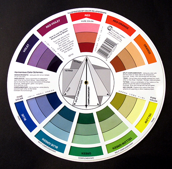
Here comes the blasphemy - real artists, brace yourselves*! Basic color theory as I apply it to painting. First off, the next two images below are not my creations, but have been
the handy digital reference I keep on my phone when I need to do a
quick check.
*Please feel free to correct/berate me in the comments if I misrepresent anything, I want to learn new things too!
Color Theory - There's a whole mess of knowledge to be had behind the idea of Primary, Secondary and Tertiary colors. For me it boils down to the idea that certain triads of colors (Red/Yellow/Blue, Red/Green/Blue, Cyan/Magenta/Yellow) can be mixed to form the various colors of the spectrum. However, as I generally steer clear of mixing colors this information is a little outside the scope of what I'm covering in the upcoming class. Definitely worth learning a little about however, the wiki entry covers the salient points and does provide a depth of insight I'll flagrantly oversimplify shortly! What I think of as a critical step in the painting process however is the idea of Color Harmony, what colors compliment each other when used together.
The three that I find most useful are Complimentary, Triad and Split Complimentary.
Complimentary - The colors opposite each other on the color wheel are called complimentary colors and generally end up providing the 'brightest' color contrast. Red and Green, Yellow and Purple, Blue/Orange (Go Boncos!) are definitely striking, but can also end up looking rather garish when paired half-and-half. I try to follow the 'three color minimum' rule so I don't really have any examples of models just painted in complimentary colors, but it's my go-to first step when trying to determine what color lenses that helmet should have, or what color the lettering should be to stand out on this hull plate, and so on.
Triad - The colors at equal points of a triangle on the color wheel form a somewhat more visually interesting combination. Again, the ratio in which they are applied is as important as the colors themselves. Applying them in equal measure is great for harlequins, but possibly overkill for marines. The Imperial Fists I've been working on are a classic case of the triad, yellow being the main color of the armour and blue and red being used as spot colors on the cabling/lenses and helmets/decorations respectively. Depending on the shades, triads can come off looking a little 'cartoony' (but I like a little of that in my 40k).
Split Complimentary - I'm a huge fan of the split complimentary, basically it shifts the opposing colors a little closer together and tends to feel a little more subdued/realistic. The recent Thousand Sons are an example of that, with the red/crimson as the main color and blue and green spot colors. A bit more muted overall but everything ties together nicely.
The Color Wheel - An actual physical color wheel is an indispensable tool to have, and basically is just a disc printed with all the colors with little spinny dials to help visualize how the various color combinations work. Pick one up from a local art supply store, you'll be surprised how much inspiration can be gained from just messing around with it. Alternately, for those more techno-savvy types with a tablet or phone, there's several online versions that are worth checking out!
Next up, now that we have a better understanding (arguably) of what colors to paint, it's time to discuss how to paint! ...Or at least, how I paint. More heresy to come tomorrow!
*Please feel free to correct/berate me in the comments if I misrepresent anything, I want to learn new things too!
Color Theory - There's a whole mess of knowledge to be had behind the idea of Primary, Secondary and Tertiary colors. For me it boils down to the idea that certain triads of colors (Red/Yellow/Blue, Red/Green/Blue, Cyan/Magenta/Yellow) can be mixed to form the various colors of the spectrum. However, as I generally steer clear of mixing colors this information is a little outside the scope of what I'm covering in the upcoming class. Definitely worth learning a little about however, the wiki entry covers the salient points and does provide a depth of insight I'll flagrantly oversimplify shortly! What I think of as a critical step in the painting process however is the idea of Color Harmony, what colors compliment each other when used together.
The three that I find most useful are Complimentary, Triad and Split Complimentary.
Complimentary - The colors opposite each other on the color wheel are called complimentary colors and generally end up providing the 'brightest' color contrast. Red and Green, Yellow and Purple, Blue/Orange (Go Boncos!) are definitely striking, but can also end up looking rather garish when paired half-and-half. I try to follow the 'three color minimum' rule so I don't really have any examples of models just painted in complimentary colors, but it's my go-to first step when trying to determine what color lenses that helmet should have, or what color the lettering should be to stand out on this hull plate, and so on.
Triad - The colors at equal points of a triangle on the color wheel form a somewhat more visually interesting combination. Again, the ratio in which they are applied is as important as the colors themselves. Applying them in equal measure is great for harlequins, but possibly overkill for marines. The Imperial Fists I've been working on are a classic case of the triad, yellow being the main color of the armour and blue and red being used as spot colors on the cabling/lenses and helmets/decorations respectively. Depending on the shades, triads can come off looking a little 'cartoony' (but I like a little of that in my 40k).
The Color Wheel - An actual physical color wheel is an indispensable tool to have, and basically is just a disc printed with all the colors with little spinny dials to help visualize how the various color combinations work. Pick one up from a local art supply store, you'll be surprised how much inspiration can be gained from just messing around with it. Alternately, for those more techno-savvy types with a tablet or phone, there's several online versions that are worth checking out!
Next up, now that we have a better understanding (arguably) of what colors to paint, it's time to discuss how to paint! ...Or at least, how I paint. More heresy to come tomorrow!
Mordian7th's Tips and Tricks, Part I - Tools of the trade
Before we dive into actually getting paint on anything I figure I'd discuss the tools of the trade! Once the models are built (which is another whole topic unto itself that I'll address in the future) it's time to start thinking about what we're going to need to get them painted.
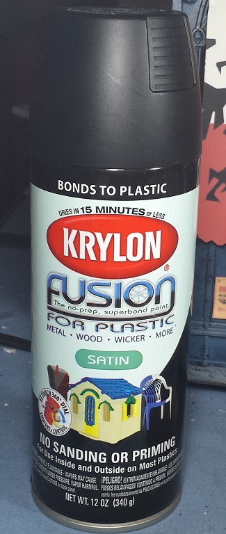
Primer - Any good paint job starts with a primer coat. While it's certainly possible to just dive in and start painting acrylics right onto the bare plastic, it's definitely not the ideal way! A preliminary primer coat gives the acrylic paint an ideal surface to adhere to and will ensure that the paint is far less likely to chip and flake off the model, as well as providing a way to pre-shade the models (depending on what colors you choose). 99% of the time I use Krylon's "Fusion" line of spray primers, and find that the Black Satin finish provides a very rich dark black. I tend to paint dark-to-light, so starting off with the black primer coat means that any little nook or cranny that I inevitably happen to miss ends up being in shadow and generally less noticeable. I will discuss alternate primer colors in an upcoming post, but suffice it to say I can count on one hand the number of times I've strayed from the dark side!
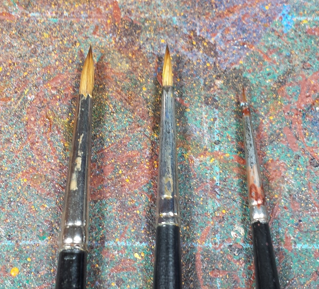
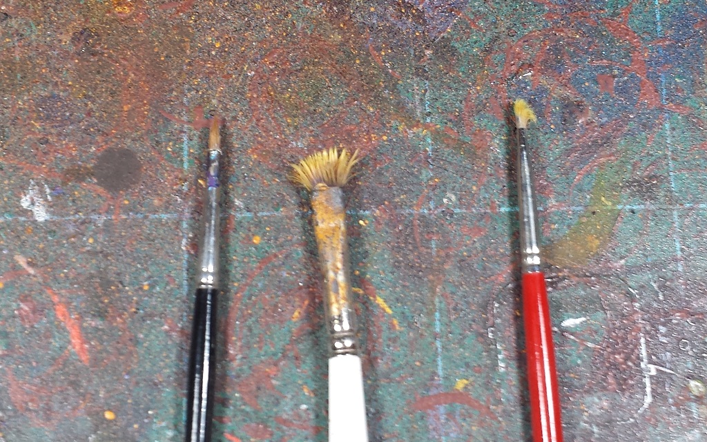
Paint brushes - When it comes to brushes, my tool kit has a bit of a split personality. I have a handful of what I consider "good" brushes (Reaper Kolinski Sable line in a 2, 1, 0, and 00), and I do my best to take good care of 'em. A decent brush is likely to cost somewhere in the $10-$20 range, and it's somewhat hard to explain what you're getting for your money. I find the difference in control and application that a good sable brush provides over a cheapo 4-for-a-dollar nylon is very noticeable, however. You really do owe it to yourself to give one a try; they keep their point better, paint is picked up by and flows from the brush better, and the cost of replacing one means that you're likely to take good care of them (or at least that's the theory)...
On the other hand, there's also a fistful of old, gnarled, splayed and terrifying brushes that end up in heavy rotation as well. Some of them are fallen soldiers, good Kolinskis that laid down their lives when my cleaning regimen was ignored or my predilection for drybrushing finally ruins their ability to hold form. Others started their lives as cheaper brushes which I find are ideally suited for sloppy base coats, stippling and scumbling for weathering, and even applying glue for static grass and such when they're really reaching the end of their work life. Even badly maintained and cheap brushes have their uses!
Cleaning - Speaking of brush maintenance, I strongly believe every painter ought to get themselves a pot of "The Masters Brush Cleaner and Preserver". It is absolutely magical stuff - keeps good brushes clean and is near-miraculous in helping badly mistreated brushes return to life. A 2.5oz pot will cost about ten bucks and will last you approximately forever. I'm still using the one that I bought nearly a decade ago, though I will admit that I'm not as rigorous in my brush cleaning as I probably ought to be. I'll give my 'good' brushes a soaping every three or four sessions, which is suitable for my needs but there's no doubt that they'd benefit from being properly cleaned every time. My lackadaisical attitude towards keeping my brushes spotless is the primary reason I've steered clear of airbrushes - I know for a fact that I'd put off cleaning it and end up with a $400 doorstop!
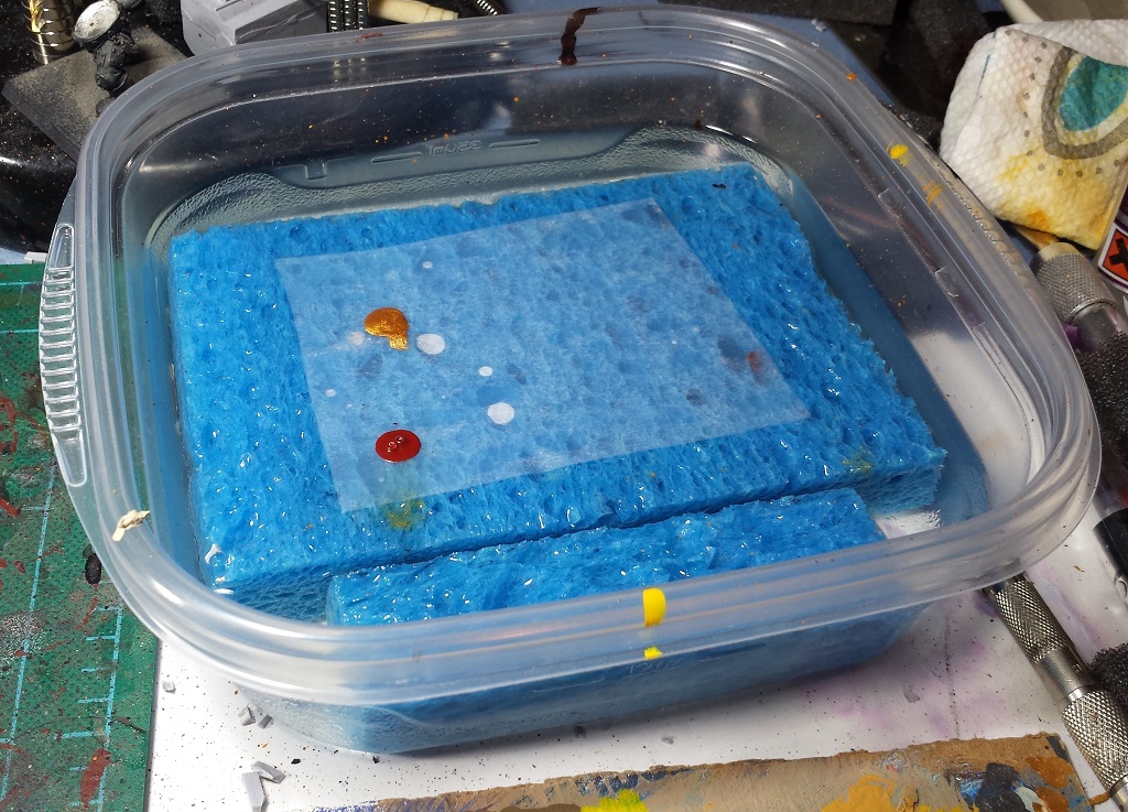
Wet palette - For a long, long time I painted straight from the pot, which was always a source of outrage to my more painterly friends. Using a wet palette is something relatively new to my arsenal, I've only been using one for the last four or five of the past twentymumble years and looking back it's something I wish I'd started using earlier. A cheap disposable tupperware container (with a lid), a sponge cut to fit, and a roll of parchment paper (which will last for a looooong time) is all you need. I'll fill the container with water to just a little below the height of the sponge, and the parchment paper wicks up just enough moisture from the soaking sponge to get damp and helps to thin the paint slightly. A few drops of paint on the palette at a time means there's not a lot of waste, and it also means that the paint pot isn't left open and drying out. I live in a state with very low humidity, so paint dries super quick here - rarely a problem with the wet palette though! While I don't do much paint mixing, it's a snap to mix up the colors on the parchment for those rare times that I do. When the paint session is done, snap on the lid and there's no mess to worry about - you do want to change the water, and wash/replace the sponge from time to time, as it can get a little funky otherwise!
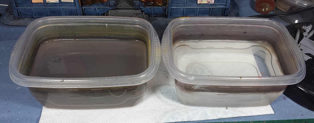
Water - As far as rinse water goes, I like to use double distilled mountain spring water that's been sanctified by a Zoroastrian minister. ...Or basic tap water when that's not available. What I do recommend is the "two tank" method. I'll have one container for the heavy rinsing to remove 99% of the paint from the brush, then a second container to get rid of any residual colored water from the first tank - this is key when painting with lighter colors (yellows and whites) where a previous dark paint could tint the subsequent lighter tones. This water gets changed out frequently, generally at the end of each painting session.
Paint - I don't have an evangelical attitude towards one paint manufacturer over another, and happily mix and match between GW, Vallejo and Army Painter, as well as the occasional super cheap hobby paint (mostly for use painting terrain). The dropper style bottles of the Vallejo line work really well with the wet palette, but there are a few colors that I find I prefer the GW line due to consistency and opacity (oranges and yellows, mostly). On the other hand, I find that I almost exclusively use GW's washes, though I do use Army Painter's Strong Tone and Dark Tone - I'd discussed them in more detail in this post from back in the day.
Light - Last but not least is light to paint by! Unless you are always able to paint during the day in a sunny room, it's absolutely worth investing in some 'true daylight' bulbs and a couple swivel-armed lamps. I find the clear bright light not only ensures the colors are coming out like you want them to, but also helps reduce eye strain which is a good thing when already trying to paint little fiddly details. Not to mention that it makes for much better picture taking on the back end once the painting is done!
Next up, color choices!
Thursday, May 14, 2015
Mordian7th's Tips and Tricks, Part 0 - I volunteered for WHAT?
So with my local gaming group scattered to the four winds, I've really just been painting for the last several months. I'd stopped by my FLGS and had brought a few minis with me to show the guys at the shop, and the topic of hosting a modeling/painting class came up. ...And for better or worse I volunteered.
So to help prepare for the class (coming up the weekend after next), I figured I'd organize my thoughts here on the ol' blog first and give everyone some insight into my process. Here's the brief outline of what I plan to discuss - expect a few posts covering the following topics over the next week!
1) Tools
Primer
Paint brushes
Wet palatte
2) Color choices
Basic color theory for non-artists
Base/Shade/Highlight
Painting in Black and White
Opacity considerations
3) Application techniques
Primer Colors
Color blocking
Drybrushing
Washes
Batch Painting
4) Fine details
Techniques
Waterslide transfers
5) Sealant and protection
Brush on vs. Spray
Gloss vs. Matte
Now I'll be the first to admit I'm no golden demon level painter, but I do like to think of what I do as a good 'gaming standard' where the mini looks good on the table. By no means will I ever assert that the way I do things is the "right way" and I'm sure that many of you talented folks will be horrified by some of my upcoming blasphemies. That said, I'm a firm believer that with some planning and a little effort anyone can paint like me - hopefully the upcoming tips and tricks may prove useful!
Saturday, May 9, 2015
Heresy Era Imperial Fists - Veteran Squad nearly complete
Real Life(tm) took up most of this past week's hobby time, but I did manage to sneak in a couple hours here and there and got the veteran squad up to the 'ready for transfers and weathering' stage as of this morning:
Still have a bit more detailing work here and there, as well as adding the red diagonal striping on the chainswords and perhaps a little red on the heavy bolters as well (they're looking a little unadorned at the moment). On the whole though, I'm pretty happy with how the unit is coming along - now if it wasn't forecast to friggin' SNOW here tomorrow I'd be able to get these guys finished. I'm running out of excuses to not finish up the 20 tac marines, may have to just suck it up and make the final push tomorrow!
Still have a bit more detailing work here and there, as well as adding the red diagonal striping on the chainswords and perhaps a little red on the heavy bolters as well (they're looking a little unadorned at the moment). On the whole though, I'm pretty happy with how the unit is coming along - now if it wasn't forecast to friggin' SNOW here tomorrow I'd be able to get these guys finished. I'm running out of excuses to not finish up the 20 tac marines, may have to just suck it up and make the final push tomorrow!
Sunday, May 3, 2015
Agents of the Emperor - Officio Assassinorum Painted
Had a bit of a restless evening so I spent some time working on the assassins last night and finished them off this morning while doing some laundry.
Thoroughly enjoyed working with these models, though in retrospect I should have left the Eversor and Vindicare separate from their terrain features for ease of painting and assembled them afterwards.
The Eversor is definitely the stand-out model of the set for me, the sense of motion is fantastic.
The Culexis has always been my favorite of the assassins, and the new model definitely doesn't disappoint. I've always loved the somewhat Giger-esque form of his helmet!
The assassin that's always been a reliable death-dealer for me in the past, the new Vindicare sculpt is probably the least interesting of of the four, but still a solid model.
The Callidus is a fantastic sculpt as well, albeit somewhat difficult to photograph - it looks a little ungainly in the pic, but it really has a lithe athleticism to it.
Overall, I really dig the new models and I really enjoyed the brief diversion from the sea of yellow I've been painting of late! Listening to Nemesis while painting these has me thinking about trying to model up a pair of Venenum and Vanus operatives to accompany these four...
Saturday, May 2, 2015
Agents of the Imperium - Officio Assassinorum built
Quick departure from the tidal wave of Imperial Fists of late - I really loved the look of the new assassin models that came out as part of the Assassinorum Execution Force game, and knew when I saw it that I had to have 'em! My FLGS got a copy in for me last night and now that I have it in hand, I have to say that while the minis are gorgeous, the game itself looks like it may be quite a lot of fun as well, which was a pleasant surprise.
Took a little time and got the four assassins included in the set built, I am really impressed with the sculpts dynamic poses and level of detail. Definitely looking forward to getting some paint on 'em, just bought the audiobook version of the Horus Heresy novel Nemesis (all about an assassin team sent to kill Horus) so that ought to provide some suitable background listening while I do so!
 |


.jpg)
.jpg)
.jpg)
.jpg)

.jpg)
.jpg)
.jpg)
.jpg)
.jpg)
.jpg)
.jpg)
.jpg)
.jpg)
.jpg)




.jpg)

.jpg)
.jpg)
