
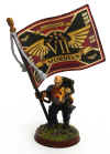
The main issue is one of colors, I knew that as the model was a vanilla build, I needed to rely on the paint scheme to drive home its Avatar-ness. That meant a fiery burning interior and the bloody hand - Simple enough! What I hadn't really taken into account was the fact that on the earlier models I'd gone with an autumnal color scheme which is also heavy on the yellow/orange/red spectrum which meant once it was all combined the model is just sort of a mooge of those colors. It turned out all right, but isn't particularly striking - for all of the colors it still feels a little monochrome.
That's not to say that I am completely displeased. I rather like how the ember-to-charcoal-to-wood transition worked on the model, and while it could be a little more refined I'm pretty happy with it as a first time try! The bloody hand turned out pretty decent as well, with a nice gory drippy feel to it.
The little green of the grass on the base helps the model pop a little, and I quite like the small leaf litter that ties together with the leaves on the model. Overall I'm only about 75% pleased with how it turned out. Workable but not particularly exciting - Part of me wants to start over with a new version and do a witchy green internal flame rather than the orange-y red. Probably a better way to go from a pure color theory standpoint!
.jpg)
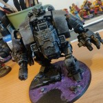
On the other hand, I started laying in the base colors on the Wraithguard squad and am much more pleased with how they're coming along!


.JPG)


Looks great to me man!
ReplyDeleteThanks man!
DeleteMaybe edge the orange/wood interface with charring? You know how coals would look with black and the glowing red veins of smoldering wood. It might help separate the wood and give it some of that fiery internals under the wraithwood.
ReplyDeleteAye, I'd taken a whack at that (it's a bit more noticeable around the legs). could stand to be pushed a little further!
Deletethat's a fine looking looking paint job in my book!
ReplyDeleteI appreciate it! Trying to look at it as a learning experience!
DeleteI think its not to bad. Perhaps a little to little contrast. Try making the wood darker in general to separate the palette from the flames. You cold add some dark green to it in the recesses like moss just to make it more of a dark brown-black-green to contrast with the flames
ReplyDeleteAdding some moss is a great idea! It needs a bit more contrasting color. Good call!
DeleteDamn fine looking Exodites! I really appreciate the way you've combined kits for something new.
ReplyDeleteThanks! It's been a fun project for sure!
DeleteLooks cool, I like he burning wood effect. Maybe charr the edges and add some white hot drybrush edges on the blackened surroundings? But looks sweet as is mate
ReplyDeleteCheers! Aye, maybe pushing the ashen edges a bit more would help!
DeleteDoesn't look monochrome to me. Looks quite busy compared to the Wraithguard (which are lovely btw) but it's supposed to stand from the crowd out isn't it? I see what you mean with the colours merging but it will be a pain to change it and no guarantee that you'll like the result.
ReplyDeleteThe roots, the roots, the roots is on fire!
Aye - Worst case, I make a second one and try a different scheme, maybe add a bit more Eldar-y bits...
DeleteThe burning wood thing is good. I see what you mean about green fire. Perhaps, before you do too much more on the army, go back and green up the leaves ?
ReplyDeleteI'll get my coat...
I'd thought about it, but I really do dig the Autumnal theme. Think going with greenish flames may be the way to go...
DeleteYeah, any given part of it looks good, but they're all too similar to give it any real focus points. Maybe dull the leaves down to something browner and less highlighted? That way they might blend in more with the wood and create better contrast for the fire. On the flipside, brightening up the fire inside the head could help bring that out more, and some more highlights on the sword could bring some attention there, since that's the one major contrasting colour so far.
ReplyDeleteExactly - It needs more contrasting color in general, and the sword can definitely come up in brightness/tone. Good call!
DeleteI think the Avatar looks great, although I can see what you mean about the fiery glow sorta blending in with the rest of the model. Can’t wait to see the finished Wraithguard either!
ReplyDeleteThanks mate! Will be giving the Avatar a bit of a think and some rework, but quite pleased with how the rest of the force is coming along!
DeleteThis project has stuck in my head and I keep coming back to it which is probably the sign of a good job :D
DeleteI did have a look at the original model and my thought was; wash the orange fire areas with reds to make it look like smoldering wood. Or you could use the Volcanic Base technique from https://www.youtube.com/watch?v=uH5C6_TxPr8 to make it look like burnt wood smoldering from then inside?
Now I want to do this model like that......
Nice! I hadn't seen that one, very interesting effect with the crackle paint!
DeleteThis is one of the most inspirational armies online. I hope you don't sell this one. I really want to see it in person. I love all the creative risks you are taking with it.
ReplyDeleteThanks very much, man! It's been a blast!
DeleteI'm digging this army, nice way to roll in a Wood Elfy theme. I like the Autumn colors. The purple is a bit clashy IMO, but who am I to say.
ReplyDeleteCheers! Aye, I think I need to go more into the greens for the sword rather than purple for a better contrast...
Deleteechoing what everyone else is saying, it looks really good, but the black charring on the wood round the lava areas would really help them stand out more and add some more contrast to the areas
ReplyDeleteThanks man! I tried my hand at the ash-y charring (most notable around the legs), but it could definitely be pushed a little further. Experimentation and practice!
DeleteWhole lotta ancient doom going here. :) Agree with your thoughts on greens for the sword.
ReplyDeleteUmm, I disagree. The "Avatar" looks flippin brill mate. Subtle wins over bold in almost every example imo.
ReplyDeleteWow! Those Wraithguard/Kurnoth Hunters look amazing! What pieces did you combine from either kit to make them??
ReplyDelete