
.jpg)
.jpg)
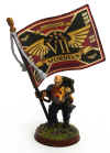
So far, so good! Plenty of further highlighting and colorization to go of course, I think the usual blue power cables and plasma coils should really help him pop once they get laid in!
.jpg)
.jpg)
I will admit that I was having more fun painting the Corvus and ended up lavishing a bit more attention on it than poor Nihilus over the last couple days. Got the reds highlighted up, the canopy painted in and laid in a little weathering here and there to help break things up a bit. I'm thinking I might do a bit of extreme edge highlighting in a hot orange on the red just to give it a bit more oomph. Wasn't necessary on the infantry, but on the larges areas on the vehicles it may look good.

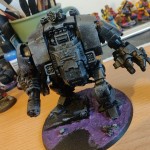
A bit more detailing on the front and undersides to go, but I really dig the profile of the model - the bog ol' inquisition symbols on the top and front are great! I do wish they'd designed the model such that the front doors were openable (they're just facade pieces that glue on to the blank plastic walls of the front of the model), but since 99.9% of the time I end up (usually accidentally) gluing the assault ramps on my land raiders shut I suppose it's not a huge deal. Hah!
Nearing the finish line! Got the basic black/line highlighting done on the remaining 6 infantry for the force over lunch yesterday, should be all done with the force by the end of the weekend!


.JPG)


Great work on both of those. The Blackstar is one of my favourite vehicles to have been released recently. It feels slightly more believable than most of the Marine flyers.
ReplyDeleteD'ya know ? I still don't like it. You're paint is exemplary but it's still ugly.
ReplyDeleteBut still not as stoopid as that DA flying plasma toilet tomb.
Looks great, I really like the marble effect on the dread!
ReplyDelete@Paul Smith: Thanks man! Aye, it's hands down my favorite 40k flyer model of the recent waves, though I will admit being somewhat disappointed in the size of the kit. Would have been much cooler about 20% bigger!
ReplyDelete@Zzzzzz: Haha! It's the flying shoe of the Space Wolves that gets the raspberry from me. Do they even MAKE enough suspensors to hold that brick aloft?
@Col. Hertford: Thanks! It's been a fun experiment, I think it'll look much cooler using a green or blue initial color - will have to find a way to incorporate that into some upcoming project!
Zomtober?
ReplyDeleteThings are coming together nicely. It is actually one of the few space marine flies I like.
Looking awesome! The colors on both are very striking against the black
ReplyDeleteThat'll be another thing I haven't seen and won't be buying because its silly. Like a flying chariot pulled by giant wolves.
ReplyDeleteBut that new giant FW flyer....
Release the flying monkeys already !
Nice detailing on both! Hadn't noticed the doors before - I like them.
ReplyDeleteLove that flyer, great work mate. Dread is coming along nicely, I may have to join Dreadtober...
ReplyDelete