
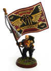
.JPG)
The yellow started off as Hot Orange, followed by Fiery Orange to get a nice smooth undercoat. Once that dried it got a few passes of Golden Yellow, and as it's a somewhat translucent color the underpinning orange gives it a nice warm glow. After that I went back in with a micron pen and cleaned up the creases between the yellow armor panels.
.JPG)
.JPG)
I tried my hand at what was originally supposed to be a NMM gold sort of thing which didn't really work out the way I'd planned. However, I do kind of like it - I might give it wash of some variety to tie it together a bit better. Wet blending/feathering is still not my forte, even after decades of trying. Heh.
Next up is the whole gemstone process, to tie these in with the Wraithknight, which I'm thinking should look pretty neat. Guess we'll find out!


.png)


.JPG)


I like the way you used the Yellow sections differently on the various vehicles.
ReplyDeleteThe blue mottling is great, the yellow accents are sharp but I have to say that your canopies are amazing. Well done sir!
ReplyDeleteI think that photo-realism is over rated. I love that your models are painterly. The stippling texture, the painted on gem highlight lines and the little roughness in your wet blending all work to act as your signature. No apologies, rather you should be proud and show it off!
Well, that looks fantastic. Aces on the canopies too and now i have the blu blockers rap jingle stuck in my head for some reason B)
ReplyDelete@David: Thanks man! I was going for a 'color-coordinated but individualist' feel.
ReplyDelete@Rabidchild: I really appreciate it! I definitely come down on the 'cartoony' side of the painting style. While I absolutely love the look of the hyper-realistic style, it's not the way I end up painting for my own enjoyment. I like my minis to have a little sense of whimsy to 'em. :)
@Frothing Muppet: Cheers, mate! I'm really having a blast painting the army so far! After sitting on a shelf in the Closet of Doom for nigh on five years it's about time they got some love! Heh.
@Zab: Thanks man! I was trying to go for the polarized gold look and fell short of the mark somewhat, but nevertheless the end result sort of works. Blu-blockers! Hah! Hadn't thought of those commercials in ages!
Cheers all!
Love them!! Could you do a tutorial on the canopies?? Also how do you use the micron pens? Every time I've tried them when I go to seal the mini it washes off!!!
ReplyDeleteI really like how the canopies are looking. Pretty unique and it works well with the scheme.
ReplyDeleteThanks folks!
ReplyDelete@EllisW: The canopies were fairly straightforward; the colors listed are from the vallejo line. Started off by painting the whole canopy Earth, then about a third of the top was painted dark flesh and a third of the bottom was painted bronze flesh. I used charred brown to blend together the dark flesh and earth sections, and then leather brown to blend together the bronze flesh and earth sections so there was a reasonably smooth gradient through the five colors. Once that was done I did an upper line highlight in bronze flesh and a little white reflection dot. As far as the Micron pens, I haven't had that problem - I use spray sealant though, maybe that's part of it? Are you using a brush-on sealant?
@Evan S: Cheers mate! It was an experiment, but it seems to set off nicely against the blue and yellow!
Think I like the canopy colours that ended you ended up with better than the gold that you mentioned and I imagined originally.
ReplyDeleteTHen again, my imagination might not be a safe place to stick gold....
Abso-bloody amazing! All of these Eldar chaps are going to look very nice grouped together
ReplyDelete@Dai: Likewise, it's starting to grow on me - sort of a nice concession between the bone color of the weapons and underside and the yellow spot colors against the blue. Definitely not what I had set out to do, but sometimes you get those 'happy little accidents' as Bob Ross would say! :)
ReplyDelete@Headologist: Thanks mate! It's all stating to come into focus now, I'll try and get an army group shot soon - pretty much everything is built, primered and in some stage of painting at this point!
Now now - those turned out really well. The yellow is quite different from what I had in mind, but it works really well.
ReplyDeleteMight I suggest adding some strong color to the guns, they look a little bland compared to the rest. I would imagine some purple jewels would go really well with the rest.
What kind of micron pen do you use/where did you get it?
ReplyDeleteBeautiful work btw!
@Manus: Thanks man! Aye, the gems are gonna get a reddish/purple effect similar to what I did on the Wraithknight. Should pop pretty well against the bone color!
ReplyDelete@Lantz M: I appreciate it! I use the 005 and 01 Pigma Micron pens from Sakura - I buy 'em locally from a number of art supply stores, but they have a website here:
http://www.sakuraofamerica.com/Pen-Archival
You can get 'em from Amazon as well. I generally use the black and brown pens, but they also do a whole slew of other colors! The very best use I've gotten out of 'em is painting pupils on eyes. The 005 is PERFECT for that.
Cheers guys!
That really is a great colour scheme.
ReplyDeleteI am loving your Alaitoc color scheme. I am totaly coveting your wraithknight too. I am going to have to copy your underslung scatterlaser. That looks way better than up by his head.
ReplyDeleteAwesome, just awesome.
@John Lambshead: I appreciate it! Hard to go wrong with blue and yellow. :)
ReplyDelete@Eldaraddict: Thanks mate! I wasn't a fan of how fiddly they looked up on the shoulders - In retrospect I wish I had gone with the scattersheild and suncannon loadout with a single underslung scatter laser. Ah well, that just means I need to do another one, right? ;)
Cheers guys!
Been thinking about your painted canopies, was wondering I have the secret weapon metallic yellow wash. Wonder if that would work also.. Humm
ReplyDelete@EllisW: Interesting! I didn't know they did metallic style washes. I've never tried any of the secret weapon washes but have heard nothing but good things about 'em. I'll have to check 'em out!
ReplyDeleteI'm really loving your color scheme and painting techniques. The hazy blue is great. And tackling 3 big tanks all at once -- more ambition than i have!
ReplyDelete@J.D. Brink: Thanks Man! I have a tendency to batch paint - it's not necessarily the most fun way to go, but it does help keep things consistent. I'm quite surprised at how quickly the grav tanks are coming together!
ReplyDeleteThey look awfully pretty! Nicely done. Great paint job.
ReplyDeleteMordian, I just found these. They are amazing. How did you stiple the blues? Sponge?
ReplyDelete@enrgie: Aye - It's pretty much all sponge work. Started with a midnight blue basecoat, then sponged on ultramarine blue, magic blue and ice blue, then gave the whole thing a guilliman blue wash to tie it all together. Worked a treat!
ReplyDelete